Preliminary Results from Open Source Evolution Analysis
I have used some form of Linux distribution exclusively for more than 10 years now and during that time a tremendous amount of change has happened at all levels of the stack. I have my own biased opinions about what has gotten better but was curious to research it a little more systematically. I decided to compare the changes across Ubuntu releases. Ubuntu is interesting because it is:
- Based on and includes the full Debian archive which is the biggest of any distribution
- The leading desktop distribution (the use I was most interested in)
- Organized as fixed time releases so any given iteration will roughly correspond to a 6 month effort by the whole community (unless packaging is lagging behind)
- Backed by a commercial entity, and so open to the question as to how the small amount of contribution by the parent company can make a difference in the much higher output of the full community
- What I actually use so I care about it more
I wrote some code that allowed me to match the source packages of two consecutive releases of Ubuntu so I could compare them.1 Once I had a set of matchups I did the comparison between two packages by doing a recursive diff that considered only the file types that could be considered source. From this comparison I calculated the number of lines added and removed and the beginning and ending size in lines of code (LOC) of the package.
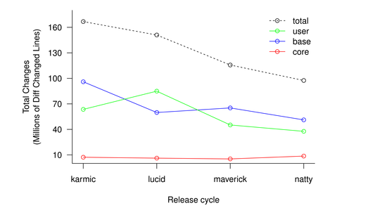
Figure 1 shows the total amount of changes (lines added or removed) of the packages in the Ubuntu main repository over the last four releases. The user/base/core split is just a rough draft at a classification and not very meaningful. It is however striking how much total development has been slowing down in this metric, more than 40%. On the other hand the absolute numbers are staggering. In just 6 months, just the narrow slice of packages in main has consistently received more than 100M lines of changes. That is 5-10 times the whole Linux kernel, every 6 months!
The fact that the amount of changes has been decreasing so much seems strange. A potential reason for this is that these four releases also correspond to the time when GNOME3 was being developed and GNOME2 was in mostly maintenance mode. Since Ubuntu does not ship GNOME3 that large effort does not get counted.
The second thing I decided to do with the numbers is figure out if there was any relationship between the size of the package and the amount of churn or mutation it received. I defined churn as being the total lines altered (added and removed) divided by the initial size divided by two. This measure is a percentage2, although if a package has grown significantly it can very well go above 100%. Figure 2 graphs the churn measure against the total LOC in a log scale. The scatter plot is far from convincing but a simple linear regression shows a statistically significant3 inverse relationship between size and churn.
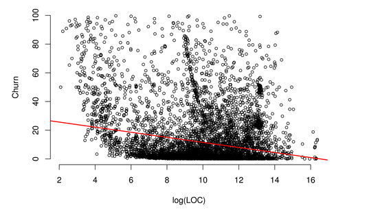
(Line is Linear Regression)
It is perhaps not particularly surprising that as a package grows bigger more parts of it are mature and the total rate of mutation as a percentage slows. If that explains the full effect then this is not a particularly insightful result. What I plan to do is use data from the Ubuntu bug database to establish a metric of maturity for a package to try and see if that explains the result or if there could also be other effects such as larger packages becoming unwieldy and harder to change. Stay tuned.
The code for these comparisons is reasonably tidy and GPL2. If you want to have a look it is up at GitHub. The whole process is packaged as a set of rake tasks so you can go from the raw packages to the final graphs by just running rake. I will warn you though that this requires downloading the whole Ubuntu main repository for 5 distributions.
-
Matching packages is generally straightforward but has some corner cases like making sure to compare glibc with eglibc. ↩
-
The division by 2 makes churn a percentage, since a line that is altered is counted twice by diff (removal + insertion). This weighs line alterations as twice the impact of pure additions or removals of code. I have planned to run diffstat with the -w option to try to get more accurate counts. ↩
-
t-value is -20.5 making this significant at p < 2e-16. Since there are many other factors that explain Churn than total LOC by itself the R-squared is very small at 0.05. This is evident in how the scatter plot does not even hint at what the regression line is. ↩